

Optimizing the browsing experience and increasing cart conversion rates.


BACKGROUND
An e-commerce website called Dealer’s Choice sells high quality playing cards for magicians, card jugglers (cardists,) and collectors. They’ve asked me to help improve their mobile-web experience.
ROLE
UX Researcher + UX UI Designer + Project Planner
TIMELINE
90 Hours | 3 Weeks
THE PROBLEM
70% of users abandon the site at the registration page—just after the cart screen.
CHALLENGE [ACCEPTED!]
Even though I am researching and iterating on a fictional website, there are no screens or designs to go off of. This complicates the project a bit because I don’t have any actual material to audit or tweak. In order to find a solution to the problem, I’ll need to find a balance between keeping my designs standard enough to not reinvent the wheel, but also unique enough to satisfy the needs of my target users— all within 90 hours.
PROJECT PLANNING + TIME BOXING TOOLS
![Project Plan for Capstone 2 [Jamie Worthy].png](https://images.squarespace-cdn.com/content/v1/61dba340986c0c0a9ffb6fd5/e3d40838-e8f4-4fc0-a1ce-1185aaff51bf/Project+Plan+for+Capstone+2+%5BJamie+Worthy%5D.png)
The standard approach to…
COMPETITOR ANALYSIS
I explored the browsing experience and guest checkout flow of three competitors to gain a clearer understanding of which UX and UI components appear to be best practices within this industry. I intended to incorporate these findings into my own designs. Additionally, I sought to discover the points of friction, if any, so that I could avoid them in my own designs.

52Kards
[One of three competitors I looked at— click this magic button to read all three!]
A different approach to…
USER INTERVIEWS PRIMARY RESEARCH
To understand the target users—magicians, card collectors, and card jugglers looking to buy cards— I took to YouTube and binge-watched review videos of competitor products filmed by these target users. I listened to uncover what they were looking for and evaluating the decks on, and in the process, discovered their frustrations when buying. With a tight schedule, analyzing these YouTube videos proved incredibly successful. Now, I had an understanding of the context, goals, and frustrations of users.

QUOTES FROM TARGET USERS
I’m listening…
“As a card collector, and I think I can speak for all of us, we are always on the hunt for a deck of cards that satisfies all the criteria: design, concept, handling, [and] price…
Now, our individual needs for each criterion—that's going to vary. But if, as collectors, it satisfies all of the above then adding it to the collection becomes easy.”
—The Gentleman Wake
Card Collector on YouTube
“If you love a deck of playing cards and you see it on the market, snag up a brick [12 decks] if you can. Because the value will severely increase and you'll find them sitting on eBay for 10 times the price”
—Chris Ramsay
Professional Magician & YouTuber
“The more you spend, the cheaper the actual purchase is. So if you plan on gifting to someone and keeping one for yourself, its [sic] better to buy multiple packs"
— Joe’s Daily
Magician & Card Collector on YouTube
PERSONAS
![Persona 1 [Shawn].png](https://images.squarespace-cdn.com/content/v1/61dba340986c0c0a9ffb6fd5/c8727c3c-c902-4187-9eca-e977bfbdf3e9/Persona+1+%5BShawn%5D.png)
![Persona 2 [Dorothy].png](https://images.squarespace-cdn.com/content/v1/61dba340986c0c0a9ffb6fd5/bb6b9bb5-0d16-4d69-b483-db2c6d64c471/Persona+2+%5BDorothy%5D.png)
![Persona 3 [Sibyl].png](https://images.squarespace-cdn.com/content/v1/61dba340986c0c0a9ffb6fd5/9325502f-861e-4440-a1b1-a987c6dd006b/Persona+3+%5BSibyl%5D.png)
KEY INSIGHTS
Decks are designed for target users, too.
Magicians, specifically, gravitate towards decks with better visual accessibility for their larger audiences.
There are, essentially, four factors users evaluate upon when choosing a deck: concept, artistry, handling, and price.
Decks sell quickly and are resold at steep prices later. And so, gifting rare decks you’ve snagged multiples of is a trend.
Credit and reputation are obviously important in the magic industry, especially with card magic. All of the review videos took particular care to note who created the tricks and flourishes they showed and give credit to all the designers and contributors to a deck’s creation.
USER FLOWS
USER FLOWS
I determined four red routes to design for this project. The first two are MVP for completed for purchase. The other two are available features the serve to help users confidently choose their decks.
Adding a product to cart.
Completing the guest checkout process.
Deck recommendation tool.
Deck comparison tool.
MID FIDELITY WIRE FRAMES
These mid-fidelity wireframes were created from eight-minute sketches I made prior to this step. My goal for this stage was to avoid reinventing the wheel by creating an e-commerce experience that was standard to the research I’d done previously. So, the only new and uncharted territory I was designing for was the subject matter, the deck comparison tool, and the deck recommender tool.
GUERILLA TESTING
I visited a Barnes & Noble book store and asked five individuals to participate in a quick test of my design. I specifically hovered around the ‘games’ section of the store hoping to find users who’d be buying playing cards— one of the individuals (who refused the test) was actually buying cards for her son for Christmas. In fact, I helped her pick out a deck of cards using the knowledge that I learned from my user research in addition to my understanding of how her son likely intended to use the deck of cards.
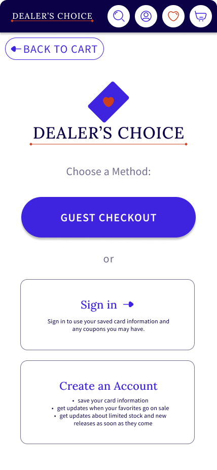
Guerilla testing revealed that the ‘add to cart’ and ‘guest checkout’ flows were currently frictionless. These tests confirmed that the deck recommender and deck compare tool were on track, but these tools could not be properly evaluated by individuals outside of the target user.
KEY FINDING
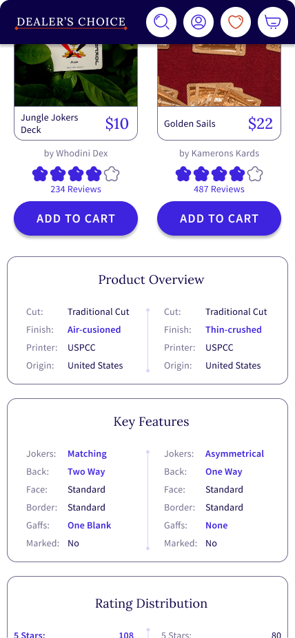
The product page lacks a review/rating system.
LESS KEY, BUT STILL IMPORTANT FINDINGS
The UI does not motivate the user to select the deck comparison tool. During the probing questions, two of the users mentioned that they didn’t even see the CTA button for the tool. Upon investigating it, they did think they would’ve used it had they realized it was there.
Considering the test structured as a scenario where they had to ‘buy a deck for a magician friend’ one of the testers mentioned that they would like to see a gift buying option but that they would still buy the deck if it weren’t available.
HIGH FIDELITY WIRE FRAMES
At this point I took some time to re-evaluate the chosen brand colors, typography, and overall brief style guide of components. From there, I created components in figma for ease and quick conversion of mid fidelity wireframes to high fidelity screens. Along the way, I used the prototype mirror view on my phone to verify that the design motivates the user to scroll beyond the fold, to confirm icon size, button positioning, and any hiccups with the placement of UI components. Based on the recommendations I received during the guerrilla testing, I added a rating and list of key features on the product page, and I also developed a rating system on the deck comparison page.
USABILITY TESTING
For this round of testing, I was able to recruit four magicians and two laypersons to participate in a round of moderated usability testing of my high fidelity Figma prototype. This wide cross-section of target users was particularly helpful as four of the six participants are active in the magic community for at least four years. Additionally, these individuals all participate in paid gigs (performances) and teach magic to new magicians in a student-created course at the University of California, Berkeley. Two of the four magician participants currently perform professionally— including competing on national television and judged by some of the top names in magic. It is important to note, however, that I wanted to perform the test with a few laypersons so as to get a different perspective on the design’s usability.
ITERATIONS
-
![]()
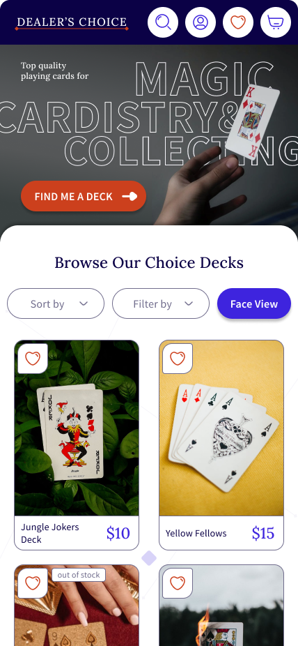
Fixin' Filters
Filters are adjusted to the side and a toggle for face/back/ and box view is added. The company logo, hero image, and call to action are tweaked to further elevate the brand.
-
![]()
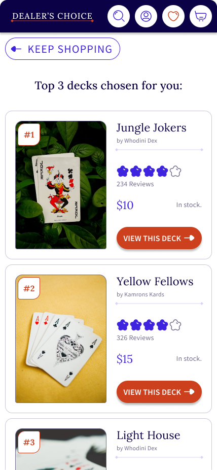
Dealin' Decks
Dealer’s Choice, a deck recommender tool, now recommends 3 decks based on the user’s input from the prequel screen.
-
![]()
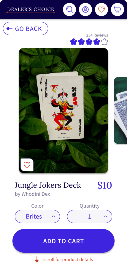
Keepin' it.
The view of the product page— no changes.
This screen was received well and nothing in testing led to any need/decisions to improve the screen. :) -
![]()
Addin' it.
Lower down on the previously mentioned product page you’ll find this key features table added into the description of each deck.
-
![]()
Keepin' it too!
This is the registration page to begin the checkout process— also, no changes. Please note the significance of the guest checkout’s call to action button for minimal friction in deciding to proceed— even without an account.
FUTURE ROADMAP
Dealer’s Choice would benefit from conducting a design sprint to further enhance the deck finder feature. Currently, the deck finder appeals more to non-magicians and it could use more advanced options to potentially appeal to magicians. Additionally, performing an A/B test of the browsing filters— specifically the toggle between front, back, and tuck case view— would validate the execution of this feature which has not been tested and is not as established in UX practice (from what I can tell from researching examples).
FINAL THOUGHTS
Dealer’s Choice was suffering from cart abandonment and poor browsing capabilities for users. To impact these metrics, I created a guest checkout to help alleviate abandonment at the registration page and also enhanced the flexibility of product browsing with ample opportunities to view, investigate, and compare products. The deck comparison tool and product page detail infographics were particularly impactful during usability testing and coveted by all participants. The deck recommender prooved helpful to the layperson who may stumble across the site for gift purchases, but otherwise would need to be workshopped if Dealer’s Choice would like to market the tool towards magicians. Overall, as my first time designing for e-commerce ever, I feel I’ve scraped the surface of the fascinating complexities which e-commerce can contain. The key to the successful completion of this project was definitely planning and time boxing— thanks past self for setting me up for success!
REFLECTED LEARNINGS
Interviewing your target users is great, but still consider a few participants just outside that target group. I received targeted feedback and insight from actual magicians about the products and how they would buy them. In addition, my non-magician participants gave constructive feedback on how potential users that stumbled onto the site would interact with it. This revealed equally important insights, such as designing for gift purchasing.
E-commerce is highly complex and convoluted because of all the details each product can have— price, rating, color, model, and so much more. A savvy designer aims to streamline the user’s experience so that they can find a specific product quickly and efficiently.
In the discovery phase of an ecommerce design challenge, make sure to interview the stakeholders about their product, brand and discounts or sales they have coming up. I based the product’s prices on the prices I uncovered during the Industry Leaders Analysis. However, I was unsure as to how a company actually determines pricing, given that real-life companies include sales and discounts. During the usability testing, all participants mentioned looking for a discount of some form. Absent any discounts, the site and its business may suffer against their competition.
It is imperative that there are multiple high-quality images of the product. Every test user tried to view multiple images of the product. Many decided to click on an item because its picture was cool.
Designing for a primarily white UI was a challenge in visual accessibility. Beware low contrasting color choices against white, especially for caption text. I performed an accessibility audit when deciding colors originally, and then again during the last iteration phase. Increasing the font weight or size can help reach AA standard.