

Optimizing the browsing experience and increasing cart conversion rates.


MY ROLE
UX Researcher + UX UI Designer + Project Planner
TIMELINE
90 Hours | 3 Weeks
PROMPT + CONSTRAINTS
Design a mobile-web, e-commerce site from scratch.
BUSINESS CONCERN
70% of site abandonment occurs at
the registration page.
There can be many reasons for site abandonment. In this case, it occurs at the registration page on a site that lacks a guest checkout. The solution: design a guest checkout for a fast and non-committal experience.
THE PROBLEM
Magicians, card jugglers & collectors have a hard time finding a deck of cards which suits their needs when purchasing online.
A non-traditional approach to primary research—watching YouTube product reviews—showed that individuals purchasing decks have a set of criteria. It can be difficult to determine how a deck fits the required criteria without experiencing it in person. The criteria: design aesthetic, story or concept, how the deck handles, and price.
SOLUTION
Find the perfect deck quickly, with no strings attached.


PRIMARY RESEARCH
A deck must satisfy a set of criteria.
In a non-traditional form of primary research, I took to YouTube to watch product review videos posted across 14 different channels. To be sure the reviews were honest, I only watched videos where the creator paid for the product and was not paid to promote it or offer affiliate links.
“As a card collector, and I think I can speak for all of us, we are always on the hunt for a deck of cards that satisfies all the criteria: design, concept, handling, [and] price…”
—The Gentleman Wake, Card Collector
DESK RESEARCH
Observing best practices through competitors.
I looked at the three most reviewed card selling companies to understand and inspire ideation and potential patterns for this unique niche in e-commerce.
Ellusionist

Art of Play

52Kards

The Magic is in the Details
All three competitors relied on robust, detailed product pages complete with high-quality product images, clear descriptions of use cases and metrics, and even full conceptual storylines to sell the mood or performance aspect to which the deck lends itself.
PERSONAS
Organizing industry terminology via
user-centric criteria.
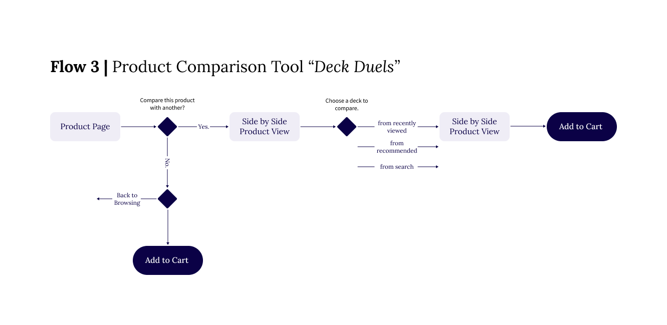
To contextualize the plethora of industry terms I uncovered and digest them alongside the insights from primary research, I developed three, unique personas to reference throughout the next phases of the project. These were particularly influential to the information architecture, and also prompted the ideation of the deck recommender and deck comparison tools.
![Persona 1 [Shawn].png](https://images.squarespace-cdn.com/content/v1/61dba340986c0c0a9ffb6fd5/c8727c3c-c902-4187-9eca-e977bfbdf3e9/Persona+1+%5BShawn%5D.png)
![Persona 2 [Dorothy].png](https://images.squarespace-cdn.com/content/v1/61dba340986c0c0a9ffb6fd5/bb6b9bb5-0d16-4d69-b483-db2c6d64c471/Persona+2+%5BDorothy%5D.png)
![Persona 3 [Sibyl].png](https://images.squarespace-cdn.com/content/v1/61dba340986c0c0a9ffb6fd5/9325502f-861e-4440-a1b1-a987c6dd006b/Persona+3+%5BSibyl%5D.png)
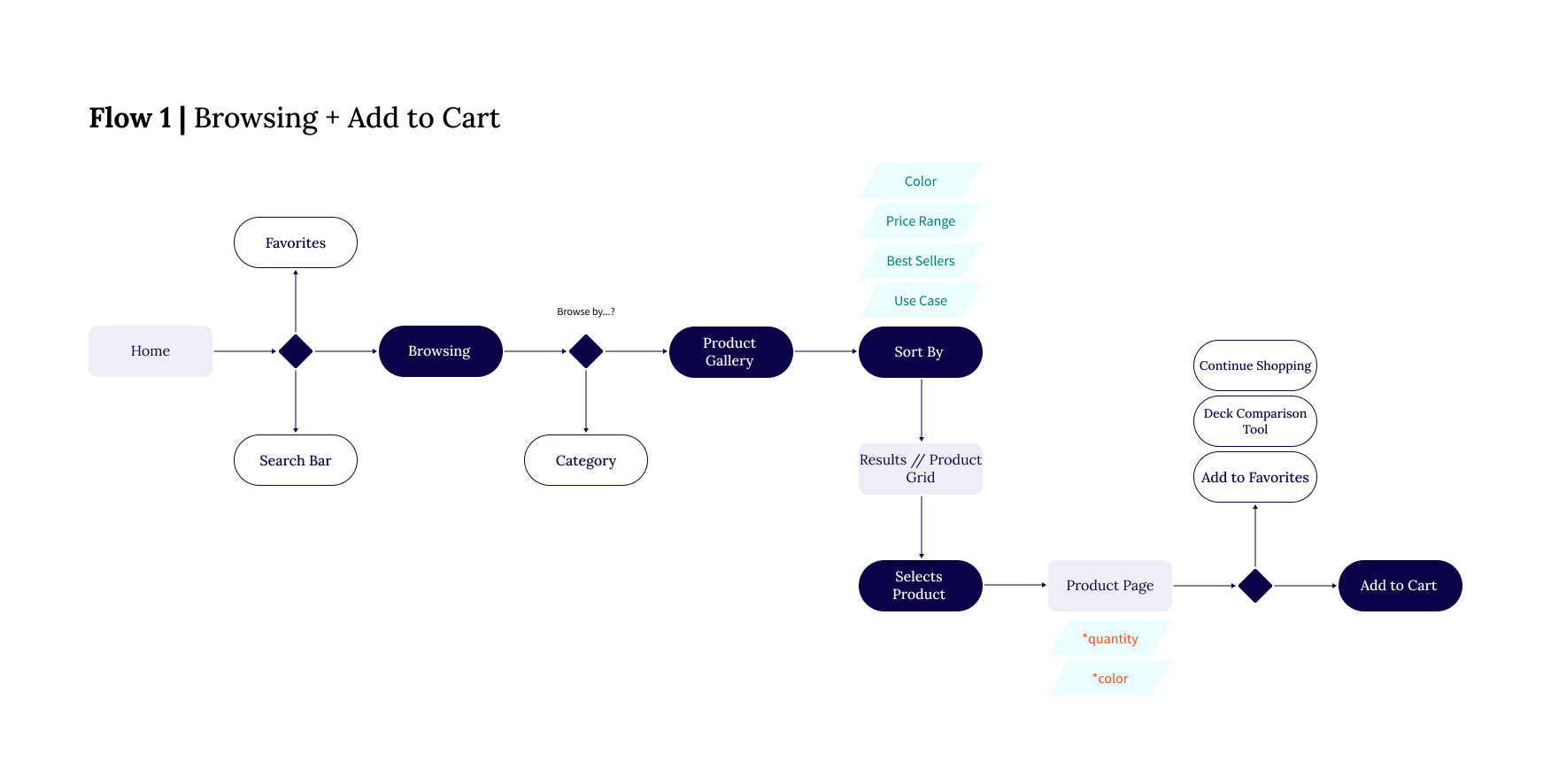
DESIGN QUESTION + USER FLOWS
How might we help users find a suitable deck?
At this point, I struggled at first to define the problem. Initially, I thought the business’ concern about site abandonment was the problem to solve. While decreasing abandonment by optimizing a tedious checkout flow is an opportunity to improve an experience, this is not the problem the users are facing when they come to the site.
More importantly: did they find the deck that suits their individual criteria?


GUERRILLA TESTING + ONE KEY ITERATION
The product page lacks a review/rating system.
A huge oversight on my part! Guerrilla testing with people I found at my local Barnes & Nobles clearly articulated the requirement of a rating/reviewing system for Dealer’s Choice—and any e-commerce experience! Just prior to testing, I got wrapped up in clearly communicating product details to the user, that I didn’t consider how they might evaluate a deck of cards that supposedly fits all their criteria. Needless to say, a guerrilla test was the right thing to do before translating my mid-fidelity wireframes into a high-fidelity prototype!
ADDITIONAL TESTING + TWO MAJOR ITERATIONS
Fine-tuning for magic users and layfolk.
Usability testing with a high fidelity prototype revealed that the experience overall was frictionless and easy to use! That being said, below are two major iterations that increase the number of recommendations for the user and improve the flexibility of the browsing experience.

FINAL SCREENS + PROTOTYPE
FUTURE ROADMAP
Dealer’s Choice would benefit from conducting a design sprint to further enhance the deck finder feature. Currently, the deck finder appeals more to non-magicians and it could use more advanced options to potentially appeal to magicians. Additionally, performing an A/B test of the browsing filters— specifically the toggle between front, back, and tuck case view— would validate the execution of this feature which has not been tested and is not as established in UX practice (from what I can tell from researching examples).
FINAL THOUGHTS
Dealer’s Choice was suffering from cart abandonment and poor browsing capabilities for users. To impact these metrics, I created a guest checkout to help alleviate abandonment at the registration page and also enhanced the flexibility of product browsing with ample opportunities to view, investigate, and compare products. The deck comparison tool and product page detail infographics were particularly impactful during usability testing and coveted by all participants. The deck recommender prooved helpful to the layperson who may stumble across the site for gift purchases, but otherwise would need to be workshopped if Dealer’s Choice would like to market the tool towards magicians. Overall, as my first time designing for e-commerce ever, I feel I’ve scraped the surface of the fascinating complexities which e-commerce can contain. The key to the successful completion of this project was definitely planning and time boxing— thanks past self for setting me up for success!
REFLECTED LEARNINGS
Interviewing your target users is great, but still consider a few participants just outside that target group. I received targeted feedback and insight from actual magicians about the products and how they would buy them. In addition, my non-magician participants gave constructive feedback on how potential users that stumbled onto the site would interact with it. This revealed equally important insights, such as designing for gift purchasing.
E-commerce is highly complex and convoluted because of all the details each product can have— price, rating, color, model, and so much more. A savvy designer aims to streamline the user’s experience so that they can find a specific product quickly and efficiently.
In the discovery phase of an ecommerce design challenge, make sure to interview the stakeholders about their product, brand and discounts or sales they have coming up. I based the product’s prices on the prices I uncovered during the Industry Leaders Analysis. However, I was unsure as to how a company actually determines pricing, given that real-life companies include sales and discounts. During the usability testing, all participants mentioned looking for a discount of some form. Absent any discounts, the site and its business may suffer against their competition.
It is imperative that there are multiple high-quality images of the product. Every test user tried to view multiple images of the product. Many decided to click on an item because its picture was cool.
Designing for a primarily white UI was a challenge in visual accessibility. Beware low contrasting color choices against white, especially for caption text. I performed an accessibility audit when deciding colors originally, and then again during the last iteration phase. Increasing the font weight or size can help reach AA standard.