

Increasing engagement among traveling photographers through photo spot sharing.
THE QUEST FOR THE PERFECT PHOTO.
DESIGN SPRINT | UX RESEARCH + UX UI DESIGN


OVERVIEW
Springboard and BiteSizeUX teamed up to create a few Google Ventures design sprint challenges modified for an individual to complete. I chose to tackle the challenge prompt for a fictional photo editing app called GramCity.
TIMELINE
1 Week
ROLE
UX Research + UX UI Designer + Sprint Facilitator
DAY ONE | MAPPING
THE PROBLEM
Photographers traveling to new cities struggle to find good photoshoot locations.
USER INTERVIEW QUOTES
Tell me more, please.
“Nothing worse than walking past a great photo op and finding out about it later! I want to know the good spots near me while I’m actually there!”
— Francesca
“I like to find hidden gems - places that not many people know about, but make for an awesome photo.”
— David
“If I find a great photo op, I’ll hop on a train and go there, even if it’s far away! For me, it's fun to go hunting for that one photo that you want.”
— Alex
KEY INSIGHTS
Users will go to various lengths of planning to get the photo they want.
Users want different types of photos: touristy, bold, unique, historic, etc.
Some of the best sources of photo inspiration come from posts curated by other photographers on social media such as Instagram.
PERSONAS
To better understand the target user, I created these personas to keep in mind throughout the sprint.


HOW MIGHT WE STATEMENTS
How might we make photo locations easy to find so that Nick doesn’t miss any photo opportunities during his travels?
How might we help Sarah plan photos more effectively so that she can photograph new and known locations?
How might we ensure the quality of photo opportunities so that Sarah snaps the photos she envisions?
MAPPING THE FLOW
From the several maps I created, the one below was chosen because it provided a solution to the personas’ goals, frustrations, and all three How Might We Statements.
HMW 1 | Nick can easily find a photo spot near him.
HMW2 | Sarah can search ‘nearby’ or by any location to plan ahead.
HMW 3 | Sarah can look at photos by other users to determine the quality of the photo spot.
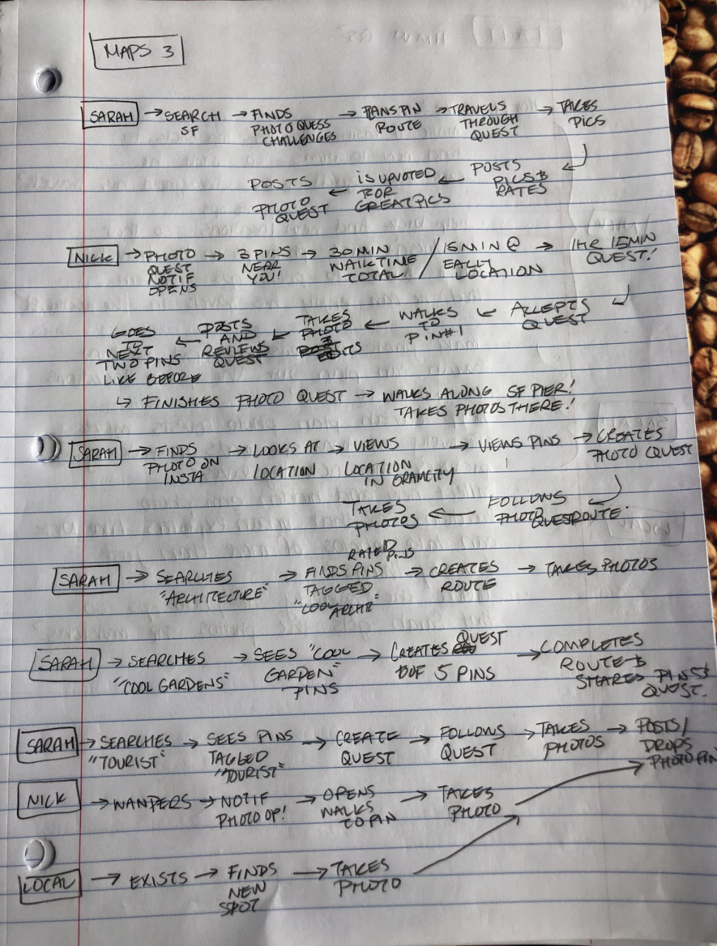
Image of the several maps made before choosing the one I would go with.

DAY TWO | SKETCHING
LEARNING FROM COMPETITORS
To gather inspiration and further understand photo app industry best practices*, I tried out 4 competitors.
* say that five times, fast
8 SKETCHY IDEAS
Now having an understanding about designing for location finding and trip planning experiences, I came up with some quick sketches to start laying out some potential solutions.
Hover on each sketch to view the notes that accompanied them. :)

This was the first ideation sketch of the bunch!
It shows the first of many quest cards, consisting of an image box, details and Call to Action Button.
The lower section represented a gallery view of potential locations for photo opportunities!

Floating ‘+’ icon meant to represent the search function or adding a stop function.
Re-labeled CTA buttons to ‘Plan’ and ‘One Shot’ respectively.
Should the user choose the ‘Plan’ CTA, it would lead to a trip planning flow with multiple stops.
If the user chose the ‘One Shot’ CTA they would then choose a nearby spot or search for one in a single trip flow.

Sketch contains the first iteration of a trip planning concept by having a ‘CREATE’ CTA button.
The quest cards in this have a star rating included, to allow the user to gauge quality of that location.

Introduction of pre-made quests as a highlight.
Additionally, these quest cards now have a level assigned to them to indicate how difficult or extensive the quest would be based off of other users feedback/reviews.

The first sketch of a map view showcasing pinned locations within the map radius and a ‘this is where you are’ indicator.
The ‘Top Quests’ section of quest cards is moved to the lower half of the screen for easier selection and to motivate the user to scroll to lower potential components or features.

Added a ‘Create Quests’ CTA button at the top of the screen.
Moved quest cards to be offset along the right of the screen so the user can swipe to view more.
These quest cards are in structured sections, easy, medium, and hard level for easier browsing.

This sketch prioritizes nearby quest cards and includes a search bar for easier map use.

Top quests carousel is moved highest point on the screen.
Map re-introduced in the center of the screen.
‘Plan’ and ‘Nearby’ CTAs moved to lower section of the screen for easier reach.
*I definitely digitized these for easier reading…
DAY THREE | DECIDE & STORYBOARD
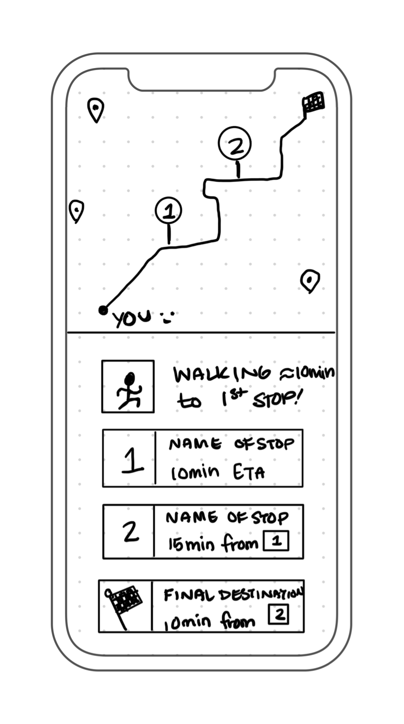
THE CHOSEN ONE [SOLUTION SKETCH]
I selected the screen to the right for its components which will lead the user to fulfill their goals of finding a new photoshoot location with GramCity.
Search Bar | With the search bar, a user can look for known locations and start adding them to their photo quest.
Map | The map view allows users to visualize the area around them. They could choose to drag the map with their finger to find new pins, to find a landmark (a lake or road for example), or to visualize the distance a quest might take them.
Recommended Quests | This component relieves cognitive load for users who do not know the area and would like to see interesting things nearby such as local landmarks, murals, and other places of interest. Instead of looking up locations and planning a trip, they can choose a pre-made and rated quest.
STORYBOARD
In creating my storyboard, I took my initial three-screen solution sketch and added screens between and around them to fill out the user’s journey as well as my previous chosen map. During the storyboarding process, I was struck with a plethora of ideas for features to include and flesh out the GramCity app and aside from a logo and brand color (bright pink), I was not limited to any preexisting style guide or design system. While most of those ideas come to life on the prototyping day, my storyboard sketches included notes on where the accent color was to be, the map style, important information architecture, navigation, and more.
-
![]()
1
Home page with a call to action for the user to create a quest or search for a location.
— -
![]()
2
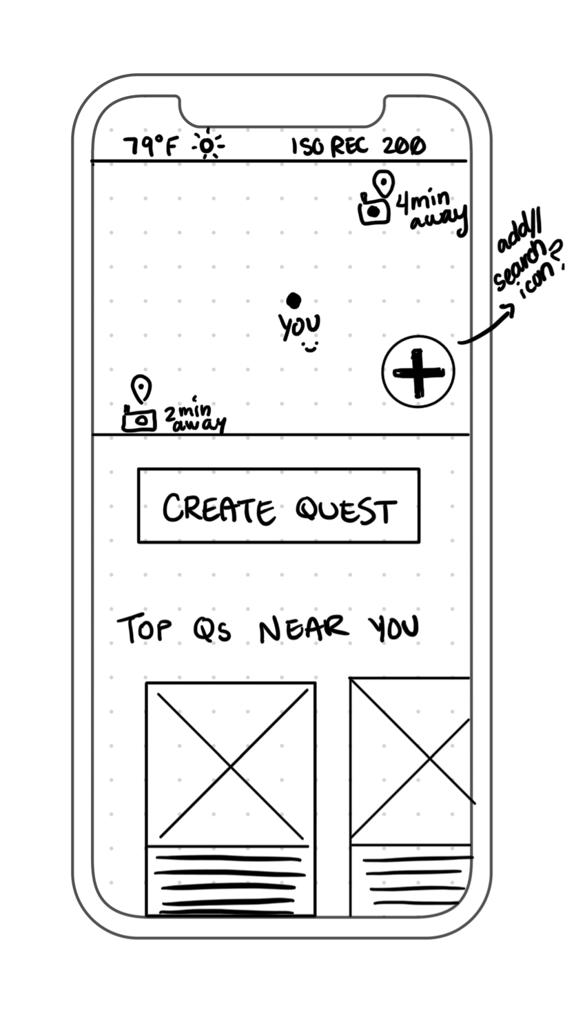
User searches ‘near me’ and is given a few nearby locations cards with details
— -
![]()
3
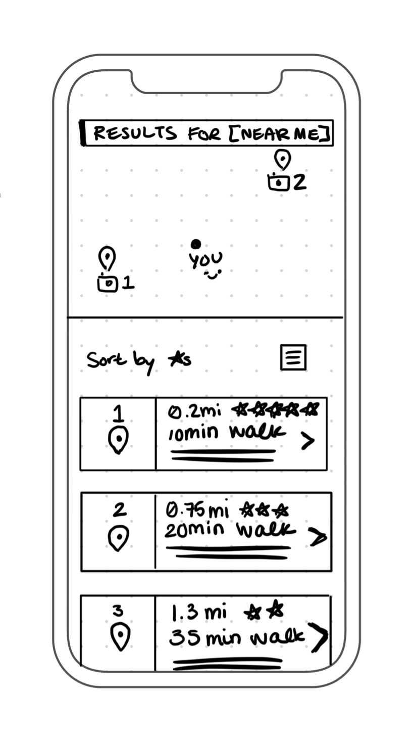
User selects a card on previous screen and is shown a description and other users’ photos tagged there.
-
![]()
4
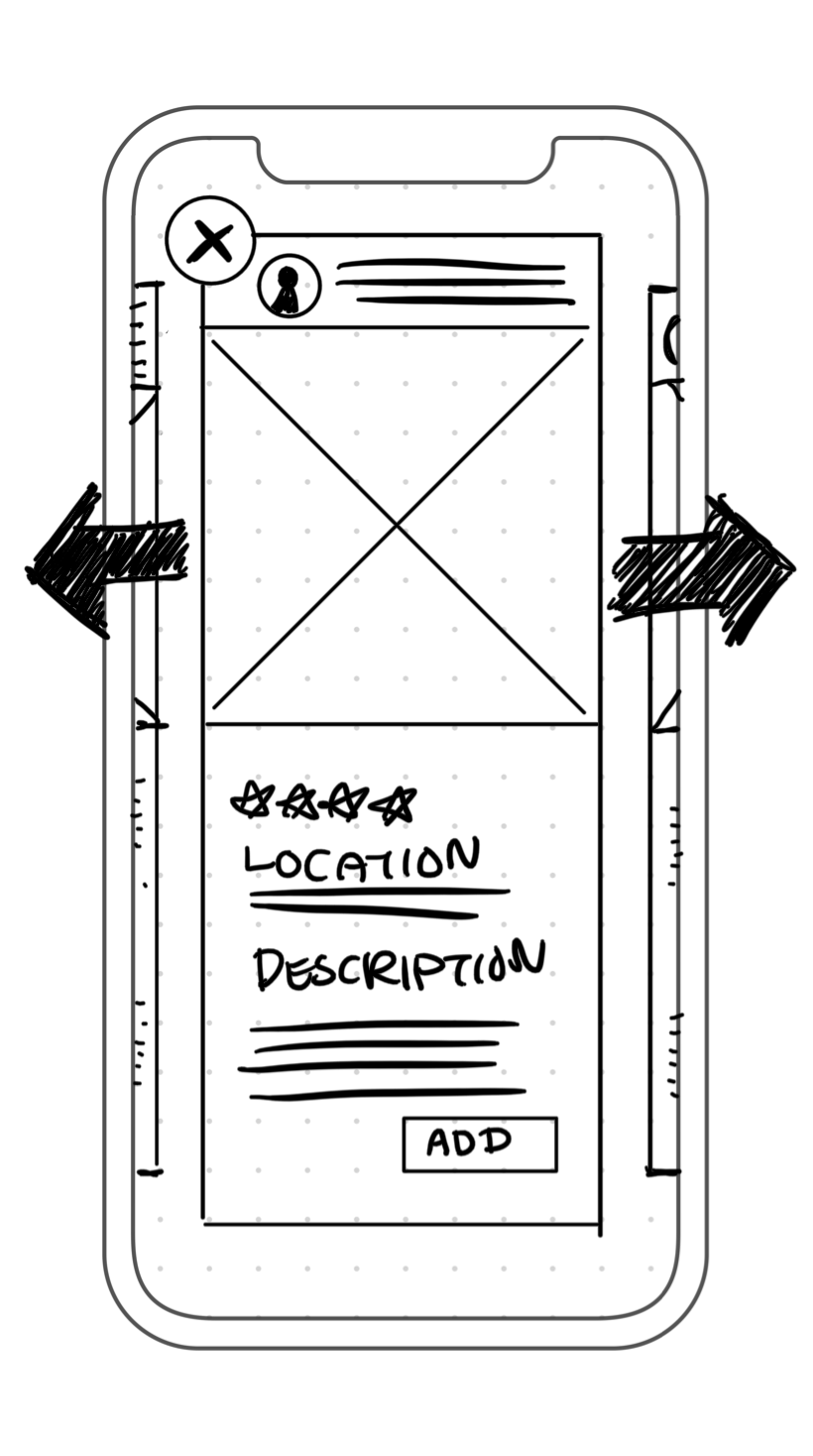
User selects ‘Add’ on the previous screen and is given an overview of their planned photo quest’s route so far.
DAY FOUR | PROTOTYPING
CREATING SCREENS
At the start of day four I did not realize just how ambitiously detailed some of my screen sketches were. However, the week before the design sprint I was re-iterating on my Hi-Fidelity screens from the previous project, and I was able to maintain my previous work pace during the design spring. By creating, organizing, and reusing components in Sketch (my choice of design software) as symbols, I was able to finish the screens for this design sprint—all within the eight hours I’d time-boxed to design. However, I did exceed my planned timeframe by an additional hour and a half to fully complete the prototype using InVision (prototyping software).
REFLECTION
For future design sprints, I will think more critically throughout the prototyping day so that I do not get caught up in the details. During testing on day five, I realized that I had fleshed out so much detail in my screens that users got curious and tried to interact with elements that were outside the scope of the feature I was testing. Perhaps if I had chosen to create my screens in Adobe XD where I could simultaneously prototype them, I would not have gotten so into the details.
PROTOTYPING
While prototyping, I weighed decisions as to how to make each screen move and connect in a way that makes sense to the user. I asked myself questions such as: Why should this be a push left instead of a slide left? Why should it be an instant transition instead of a pop? Each answer results in different feedback and communication to the user, and taking the time to carefully make those decisions allows me to truly test that the design works as intended: smoothly and appropriately.
DAY FIVE | VALIDATE
TEST PARTICIPANT BACKGROUND
On the first day of this design sprint, I reached out to five photographers. I initially viewed most of these individuals as hobbyists who take great photos on their travels. What I didn’t know was that four out of the five photographers are actually advanced in their understanding of and dedication to photography. The first tester is a partial owner of their family’s photography studio and business. The second tester works in social media and regularly plans photo shoots. Both the third and fourth testers are hobbyists, one who does extensive location scouting for shoots, and another who practices at home with their family for portrait-style photos. The fifth tester owns his videography business and currently is doing work for a big new studio.
WHO WOULD USE PHOTO QUEST?
All five of my users gave me outstanding feedback! That being said, the majority of their backgrounds are in professional photography rather than more casual photography. I asked all of my users who they thought would actually use the photo quest feature, and four out of five users thought it would best suit tourists or individuals who primarily take photos with their phones.
KEY FINDINGS
Aside from minor usability issues, the five tests yielded two simple, yet significant, results:
Users take photos with their actual cameras and not just their phones.
Users want to know about the obstacles (weather, crowd, lighting, etc.) that may get in the way of capturing their envisioned photos.
REFLECTION
From my interviews, I learned that a significant part of getting the perfect photo comes from how one prepares and how one sets up their camera. While many are satisfied with photos taken from their phone, an important, core app user may also be interested in taking photos with professional-grade equipment. To increase the return rate for users who prefer their cameras when shooting, adding the functionality to upload a photo from their phone's camera roll or from Google photos is recommended.
While not as surprising, learning about what photographers think about leading up to a shoot provided me with a lot of additional insight as to how to refine the app. For example, too many people around can make it difficult to get that perfect photo, but that is just one obstacle. These interviewees talked about the sun and its position, the intensity of the wind, the fabric of the outfits, the clarity or choppiness of the water, the props, and so much more. I think if I had been able to interview users at the start of the design sprint, I may have learned even more about what things photographers take into consideration before a shoot. The main takeaway is that a detailed description of the location is vitally important for the user. Users really want to know as many details as possible in order to fully understand the environment and the obstacles to their perfect photo. By providing a level of detail users can create a plan to successfully compose the photos they envision. Also, users that stumble upon a photo pin can decide if it's worth checking out or if they won’t be missing out if they were to skip that spot.
ITERATIONS [MINOR CHANGES]
Below are the iterations of all the screens I made during this project. Due to time constraints, I was able to fix most minor usability issues but have yet to fully iterate on the feedback regarding the collective users’ desire to know about a location’s weather, crowdedness, lighting, and more.

DAY SIX | FINAL THOUGHTS
KEY LEARNINGS
Stay focused and stay within the scope of the sprint.
Reflecting on the time I spent building and prototyping I realized that my screens and prototype were pretty Hi-Fidelity, perhaps too much so. Although it's comforting to know I can place and push pixels relatively swiftly, this is not the goal of a design sprint. I’ve learned not to put too much time and effort into new ideas, especially thoroughly fleshed out ones, because five user tests later the idea might be scratched altogether.
Consider if the usability testers are also our target users.
I noticed an immediate hiccup when I began my user testing: my users were not quite representative of the personas I was given. The testers were more professional photographers while the personas portrayed casual photographers. And so, I learned a rift can occur between the design process, the research synthesis phase, and the user testing phase.
If those validating the design are even a little bit outside of your target user group, it has the potential to shift the project. These users will have different needs, wants, goals, and frustrations than those your product aims to solve. For GramCity: The Photo Quest the next step is to further define the scope of the project by either focusing solely on the everyday phone photographer or widening it by making the lens (yes, a photography pun) in-depth enough to satisfy the pros while maintaining simplicity for the everyday user. In a real-world situation, this design decision would be made after discussing business goals with all stakeholders and leveraging all relevant data available.
Sometimes usability and instinct are the same thing.
I was surprised when all five usability testers decided to try and zoom in on the map and drag it around throughout their tests. After confirming their intentions at each first attempt, I then mentioned that the prototype was not capable of functioning in that way. User expectations when interacting with map interfaces has become so widely uniform that it is borderline instinctual: see a map, drag the map. This suggests that in a real-world experience, if a reaction from your product is not what the user expects in one of these well defined experiences, the user might try to repeat the action thinking they did it wrong or that the product malfunctioned. This can cause frustration and annoyance for the user and could irreparably damage the overall satisfaction of the experience. Additionally, this could impact a variety of business goals including rates of retention, conversion, likelihood to recommend, brand loyalty, and more.